My Quote Request
Google Ads Management
Landing Pages
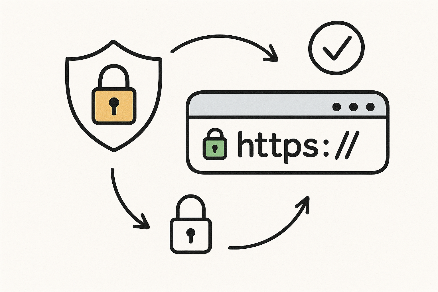
Welcome back to our Foundational SEO for Webflow series! So far, we've covered meta titles and descriptions and securing your site with HTTPS. In this third installment, we're diving into a topic that's absolutely critical in today's mobile-first world: responsive design.
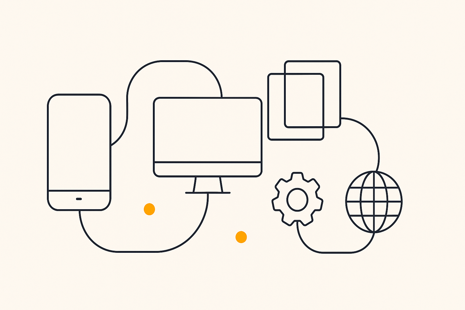
With more than half of all web traffic now coming from mobile devices, having a website that looks and works great on any screen size is no longer a luxury—it's a necessity. Google has adopted a mobile-first indexing approach, meaning it primarily uses the mobile version of your site for ranking and indexing. You can see how your site performs on mobile and other devices with our Webflow SEO Checklist.
A responsive design automatically adjusts your website's layout, content, and navigation to fit the screen size of the device it's being viewed on. Here's why this is so important for your Webflow site's SEO:
Google's Mobile-First Indexing: As mentioned, Google now predominantly uses the mobile version of a site for ranking. If your site isn't mobile-friendly, your rankings will suffer.
User Experience (UX): A poor mobile experience leads to high bounce rates and low engagement, which are negative signals to search engines. A responsive design ensures a positive UX for all users.
Improved Rankings: Mobile-friendly websites are rewarded with higher rankings in mobile search results.
Webflow is renowned for its powerful and intuitive responsive design tools. Here's how to use them to ensure your site is perfectly optimized for every device:
Use the Device Preview Icons: At the top of the Webflow Designer, you'll see a set of icons representing different screen sizes: Desktop, Tablet, Mobile Landscape, and Mobile Portrait.
Start with the Base Breakpoint (Desktop): Design your site for the desktop view first. This is your base style, and changes you make here will cascade down to the smaller breakpoints.
Adjust for Smaller Devices: Click on the tablet icon to switch to the tablet view. You can now adjust the layout, font sizes, and other styles specifically for this breakpoint. These changes will not affect the desktop view.
Continue to Mobile: Move down to the mobile landscape and mobile portrait views, making adjustments as needed. The styles you set on larger breakpoints will cascade down, so you only need to make changes where necessary.
Use Relative Units: Whenever possible, use relative units like percentages (%), viewport width (VW), and viewport height (VH) for widths and heights. This allows elements to scale fluidly with the screen size.
Optimize Images: Large images can slow down your site on mobile devices. Use Webflow's responsive image feature to serve smaller images to smaller devices.
Test on Real Devices: While Webflow's device previews are excellent, it's always a good idea to test your site on real mobile phones and tablets to ensure everything looks and works as expected.
Creating a mobile-responsive design is a cornerstone of modern SEO. With Webflow's powerful tools, you have everything you need to build a website that provides an exceptional experience for every user, on every device. This not only improves your SEO but also enhances your brand's credibility and user engagement.
Is your site truly mobile-friendly? Get a free analysis with our Webflow SEO Checklist to find out.
Next up in our Foundational SEO for Webflow series: Connecting Your Site to Google Search Console